We have certainly seen a major resurgence in white kitchen cabinetry over the last ten years. As of late, however, the tonal quality of the white has been shifting. Consumers are showing a preference for more off-whites, less stark, leaning toward whites that are more natural. Trending has also been the design decision to pair these tonal whites with medium to light true-brown stains vs. having an all white kitchen. I recently came across this kitchen, designed by Lindsey Markel of Dillman & Upton, using Dura Supreme cabinetry and masterfully incorporating this trend of tonal whites with mid-brown stain.
Let’s take a look…
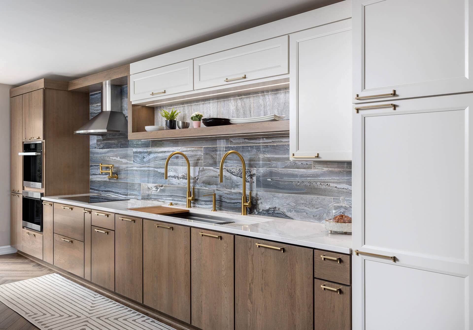
Dura Supreme cabinetry- Lauren door style in Pearl, Camden door style in cherry with Cashew stain. Design by Lindsey Markel of Dillman & Upton
Above we see Dura Supreme’s Lauren door style in a Pearl paint finish. The long gentle bevel of the inside edge profile pairs perfectly with the angle of the hood. The slab doors are Dura Supreme’s Camden door style in solid cherry, stained in Cashew. These two finishes, when paired with the organic vibe of the backsplash gives off a very natural aesthetic. The brushed brass plumbing fixtures and Warm Brass hardware from Atlas complete the look.
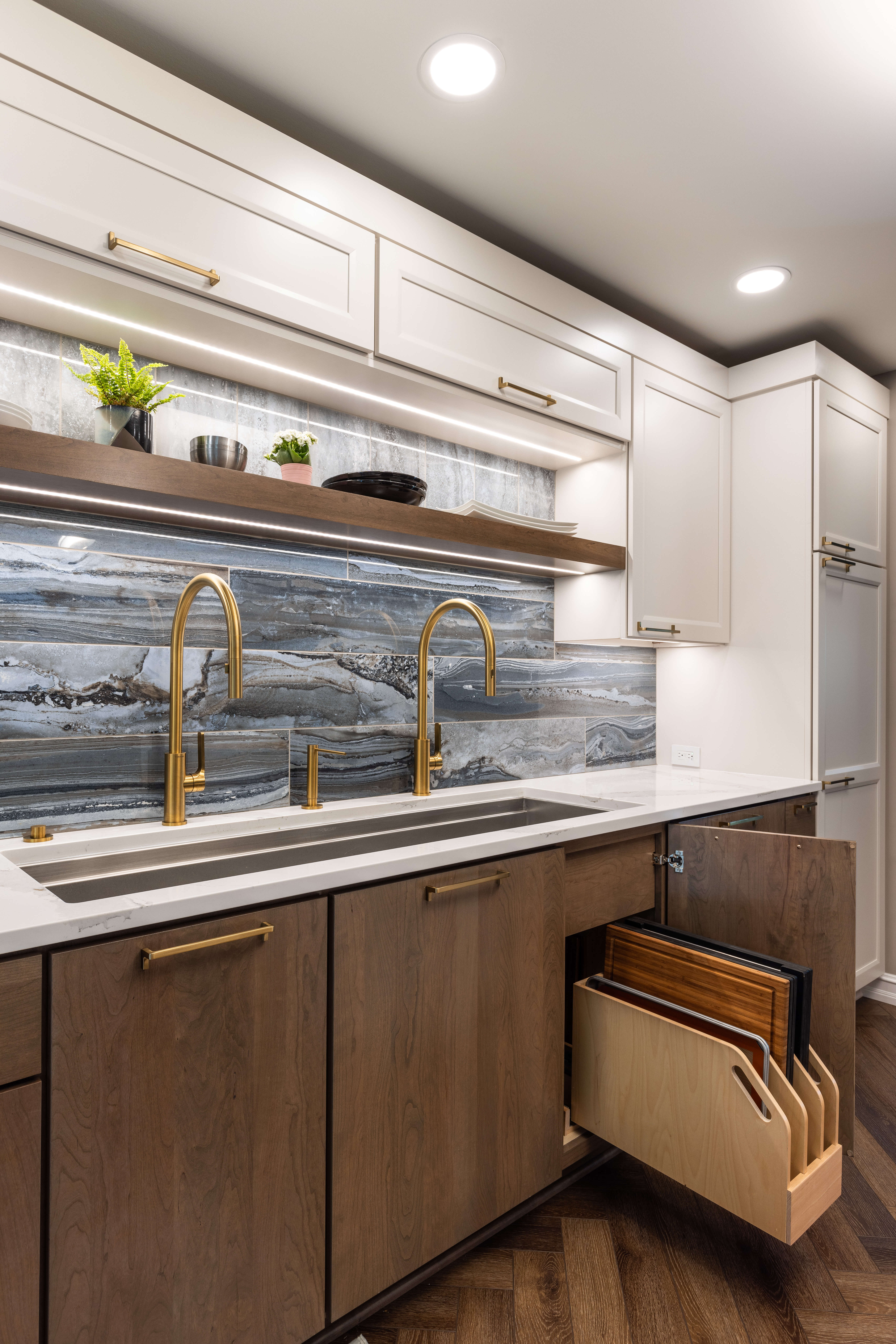
Dura Supreme Cabinetry- Tray Roll-Out, Lauren door style in Pearl, Camden door style in cherry with Cashew stain. Design by Lindsey Markel of Dillman & Upton
The homeowners are very talented cooks, fueling the need for specific utensil and tool storage and prep space. Below we see specialized spice and knife storage flanking the cooktop, and well as the perfect place for a shallow roll-out above a deep drawer.
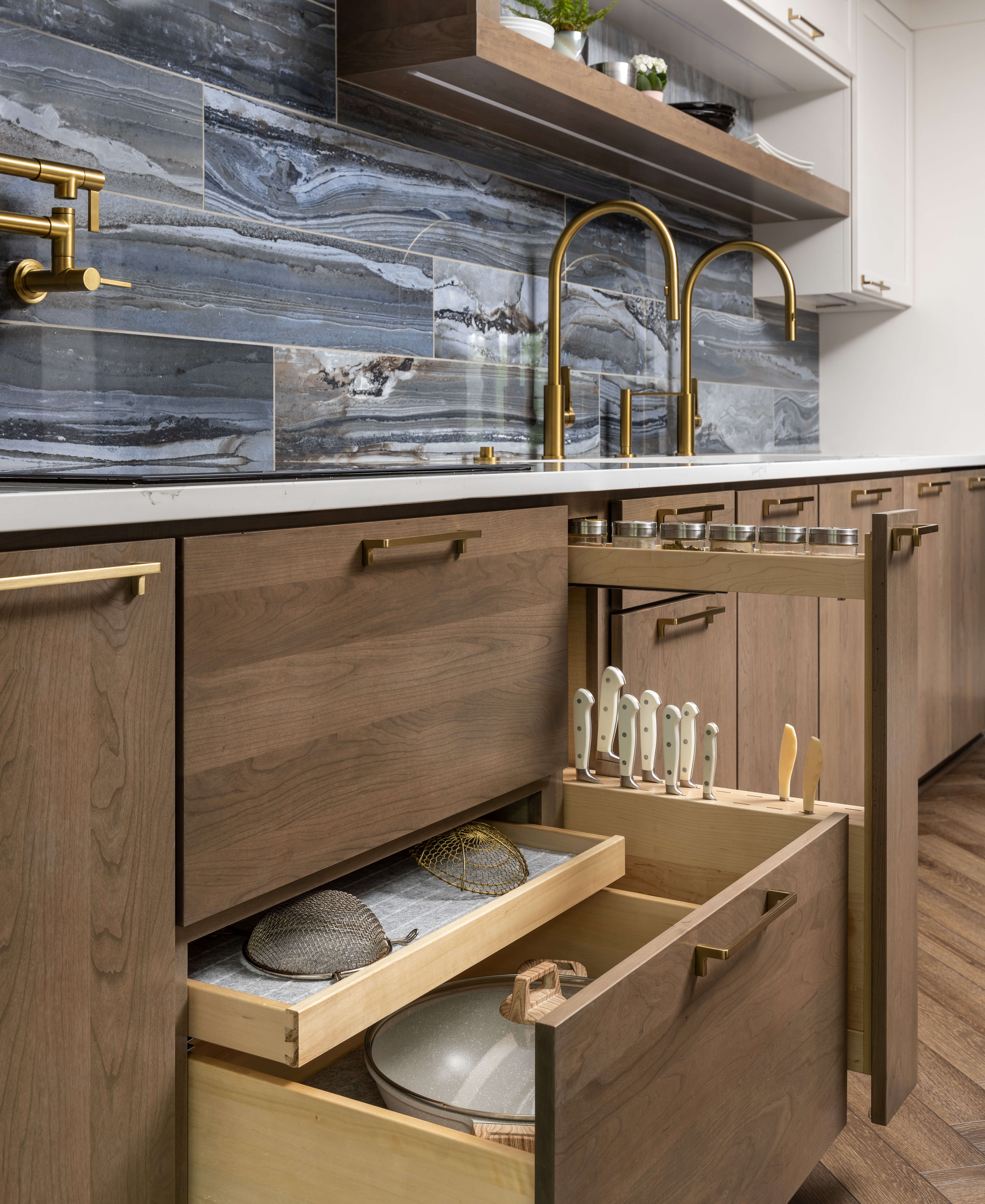
Dura Supreme Cabinetry- Spice organization/ Knife storage pull-out and Shallow Roll-Out Above Drawer. Camden door style in cherry with Cashew stain. Design by Lindsey Markel of Dillman & Upton
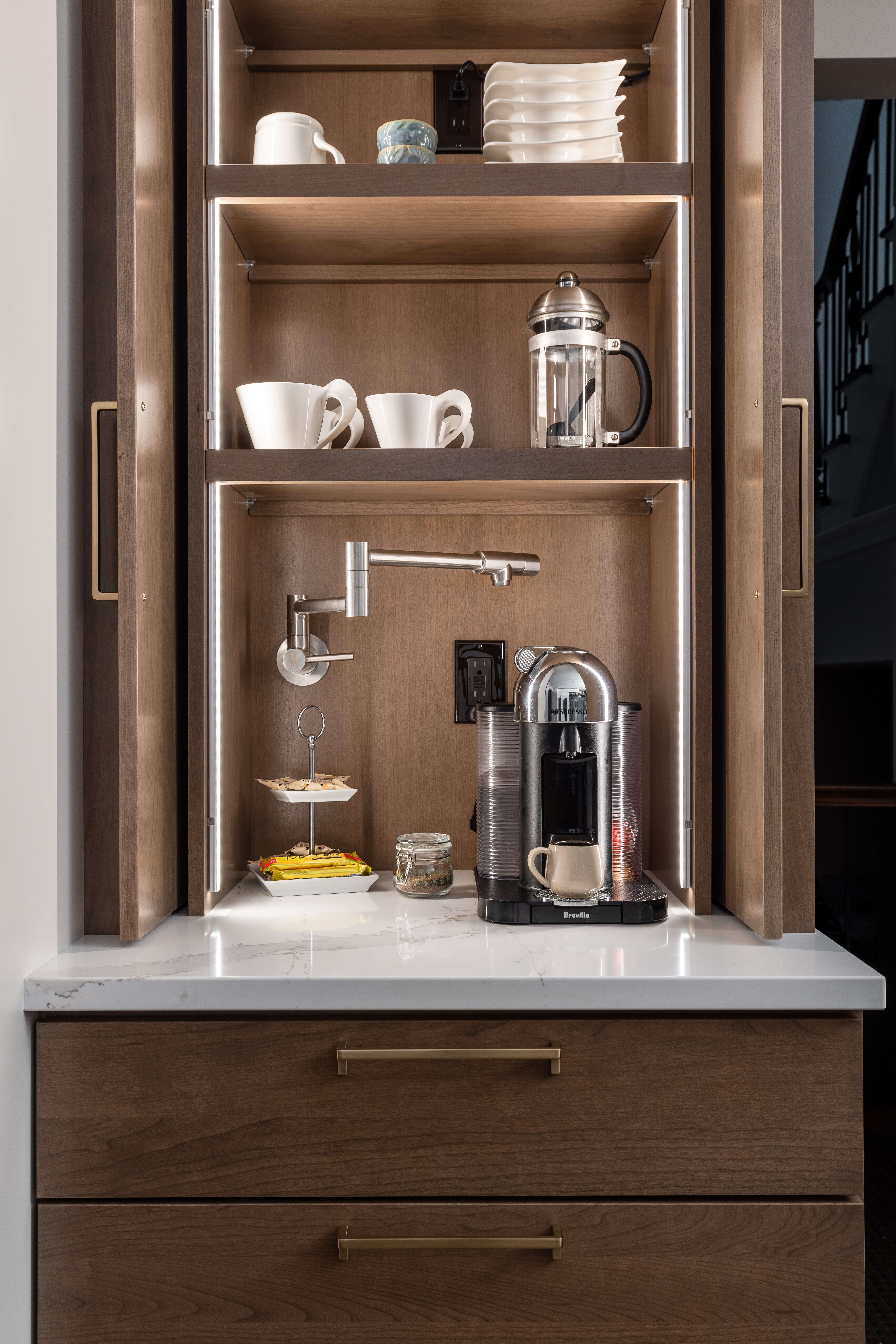
A coffee station was an important consideration in this kitchen design. Honestly, with a coffee-drinking owner, it makes total sense to take some time on this piece of functional design that affects quality of life every morning, or afternoon, or even during late night work/study session!
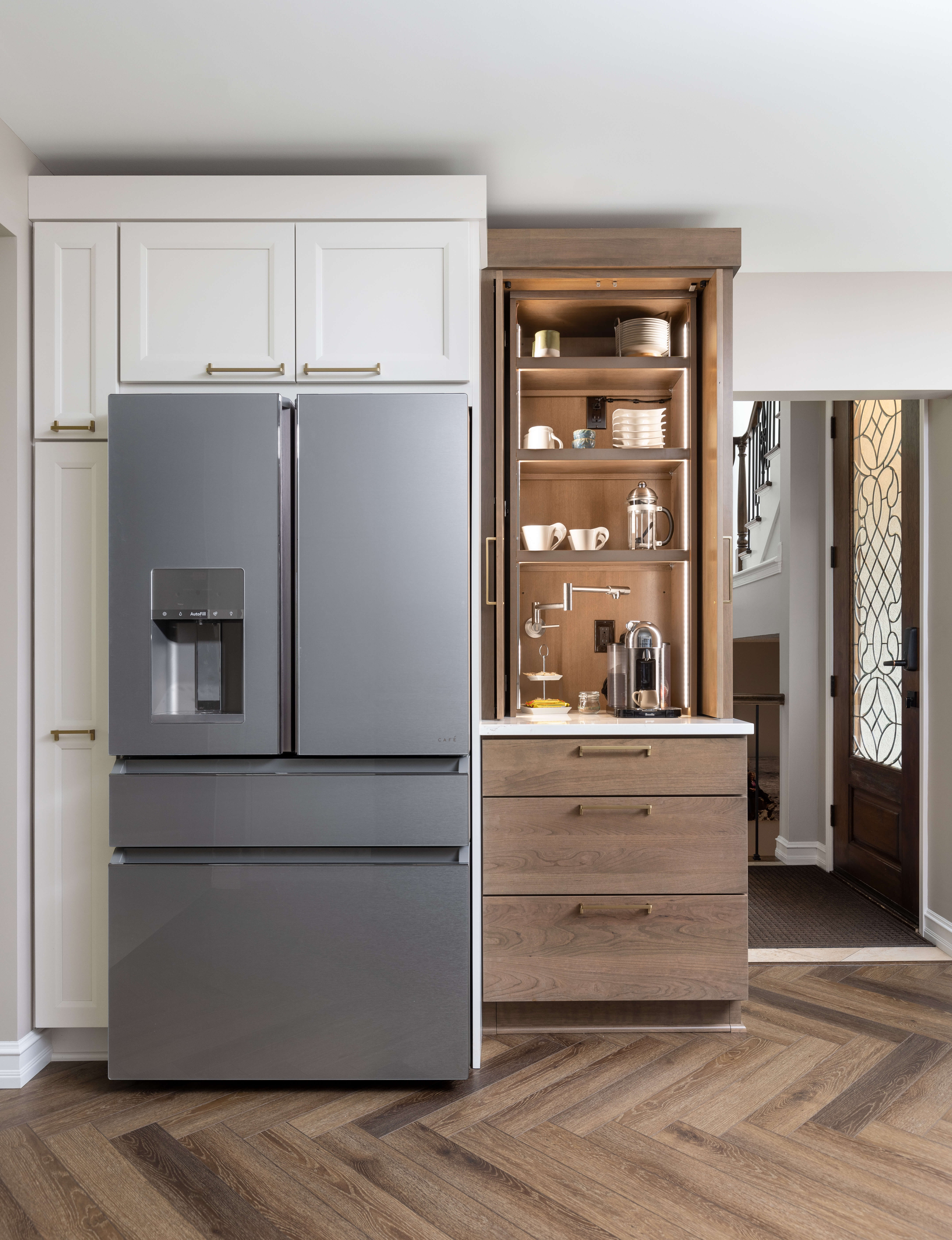
Dura Supreme Cabinetry- Lauren door style in Pearl, Coffee Station in Camden door style in cherry with Cashew stain. Design by Lindsey Markel of Dillman & Upton
You will see below that care was taken in the design to include integrated plumbing, electrical, and in-cabinet lighting. Here they have everything at their fingertips to create the perfect beverage.
Dura Supreme Cabinetry- Coffee Station with integrated plumbing and lighting. Design by Lindsey Markel of Dillman & Upton
I would be remiss if I did not mention the gorgeous herringbone wood floors. The true brown tones in the floor’s stain just ‘sing’ alongside the Cashew-stained cabinetry.
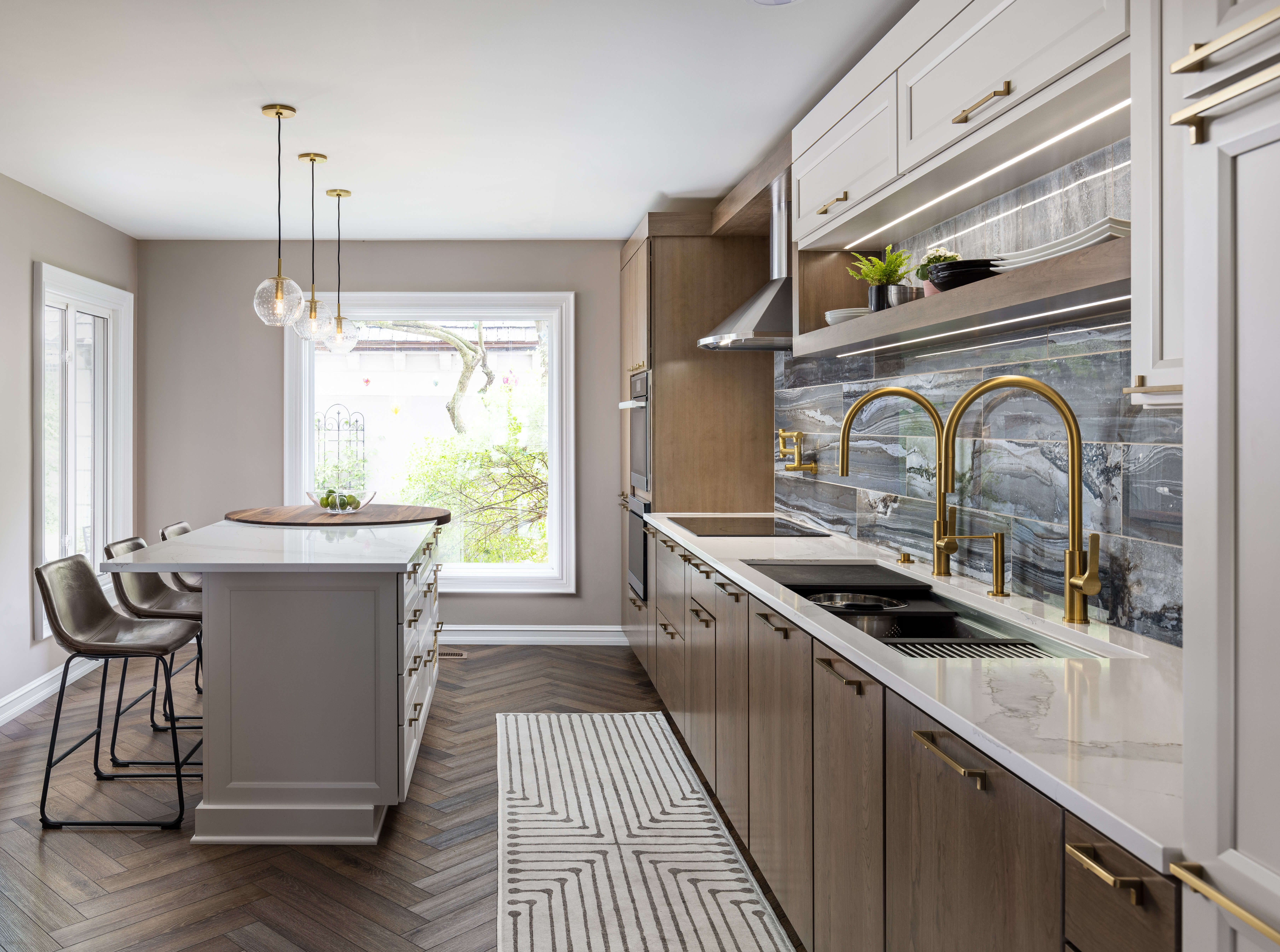
Full view of kitchen towards windows. Dura Supreme cabinetry, design by Lindsey Markel of Dillman & Upton
In this view above you can also see the round walnut inlay countertop at the end of the island, warming up the otherwise all white island. With all of the natural light, and the light provided by the airy globes above the island, this kitchen is definitely a place these owners want to spend time in. It is the perfect blend of relaxed and refined, which is not easy to accomplish. Hats off to Lindsey Markel and her talent for listening to her client’s needs and turning their kitchen into an absolute show-stopper. I hope this prime example of tonal white trends resonates and inspires your next design!
