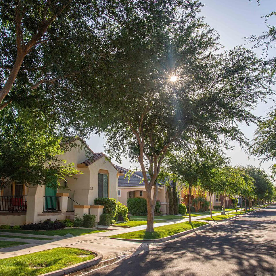
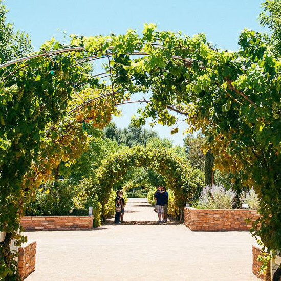
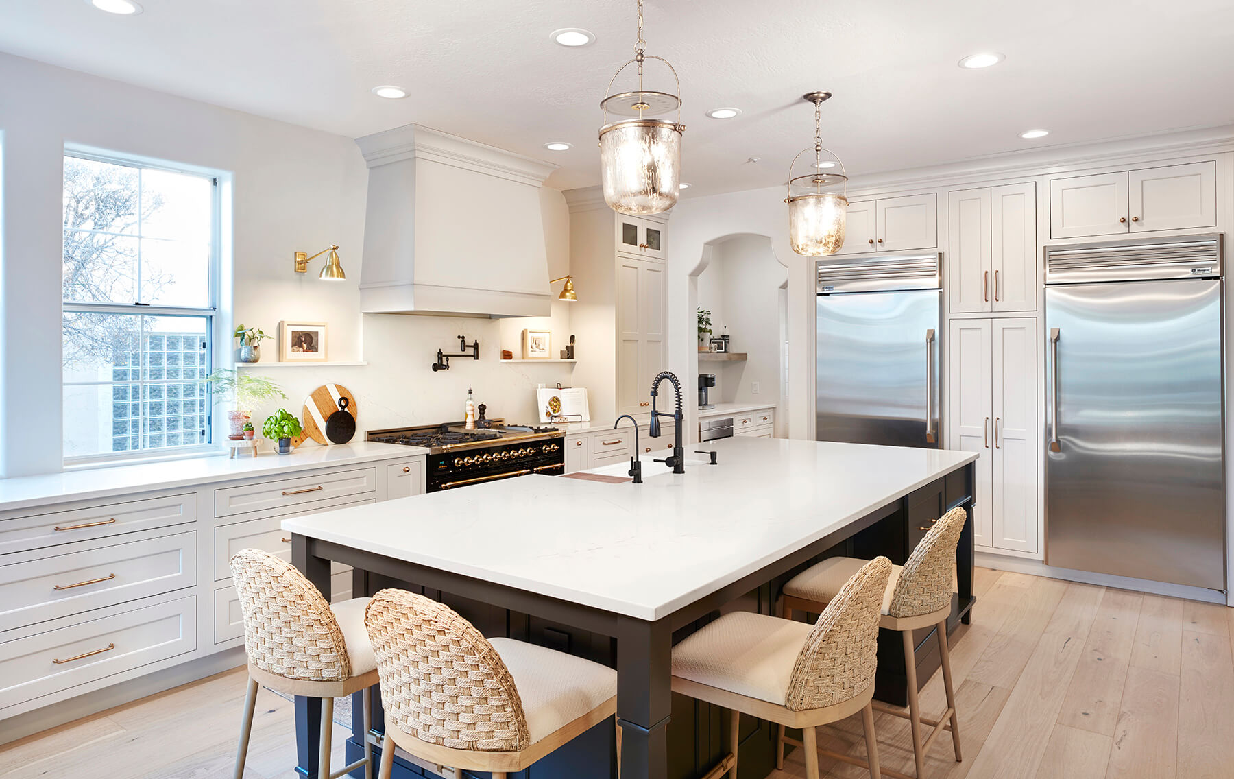
In today’s blog, we visit a Gilbert, Arizona home, nestled in a gem of a neighborhood found in the middle of the suburbs, surrounded by 11 acres of urban farmland. The agricultural community has tree-lined streets, many front porches, and a variety of farmhouse and artisan styled aesthetics that you do not typically see in Arizona homes.
The homeowner, Denise, felt the original kitchen was too dark and, most of all, it did not reflect the modern village lifestyle of her community that she is very passionate about. It needed a remodel and she knew Carrie Paulus of Primera was the perfect designer for the job.
From Dark and Cramped to Bright and Spacious
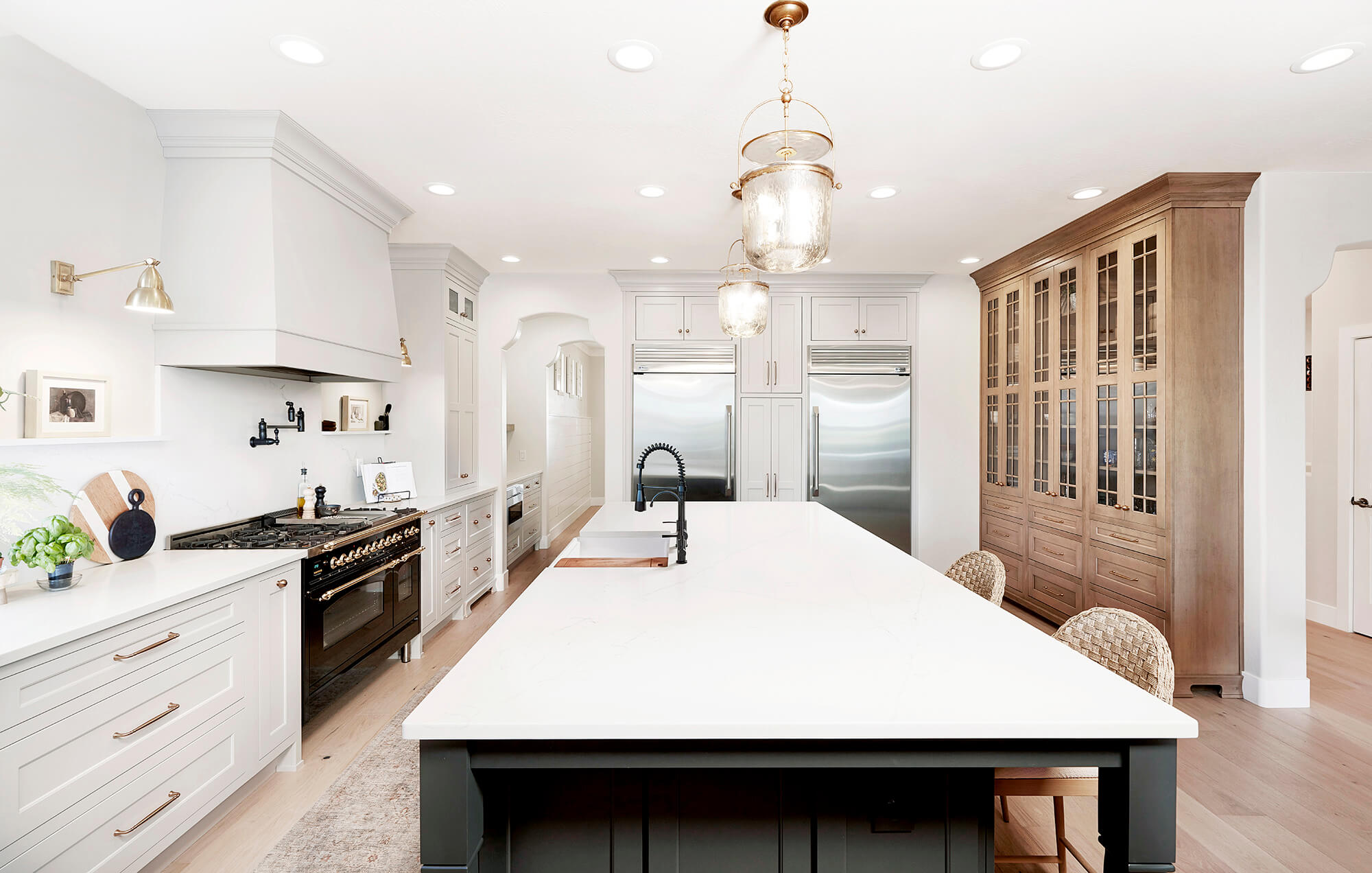
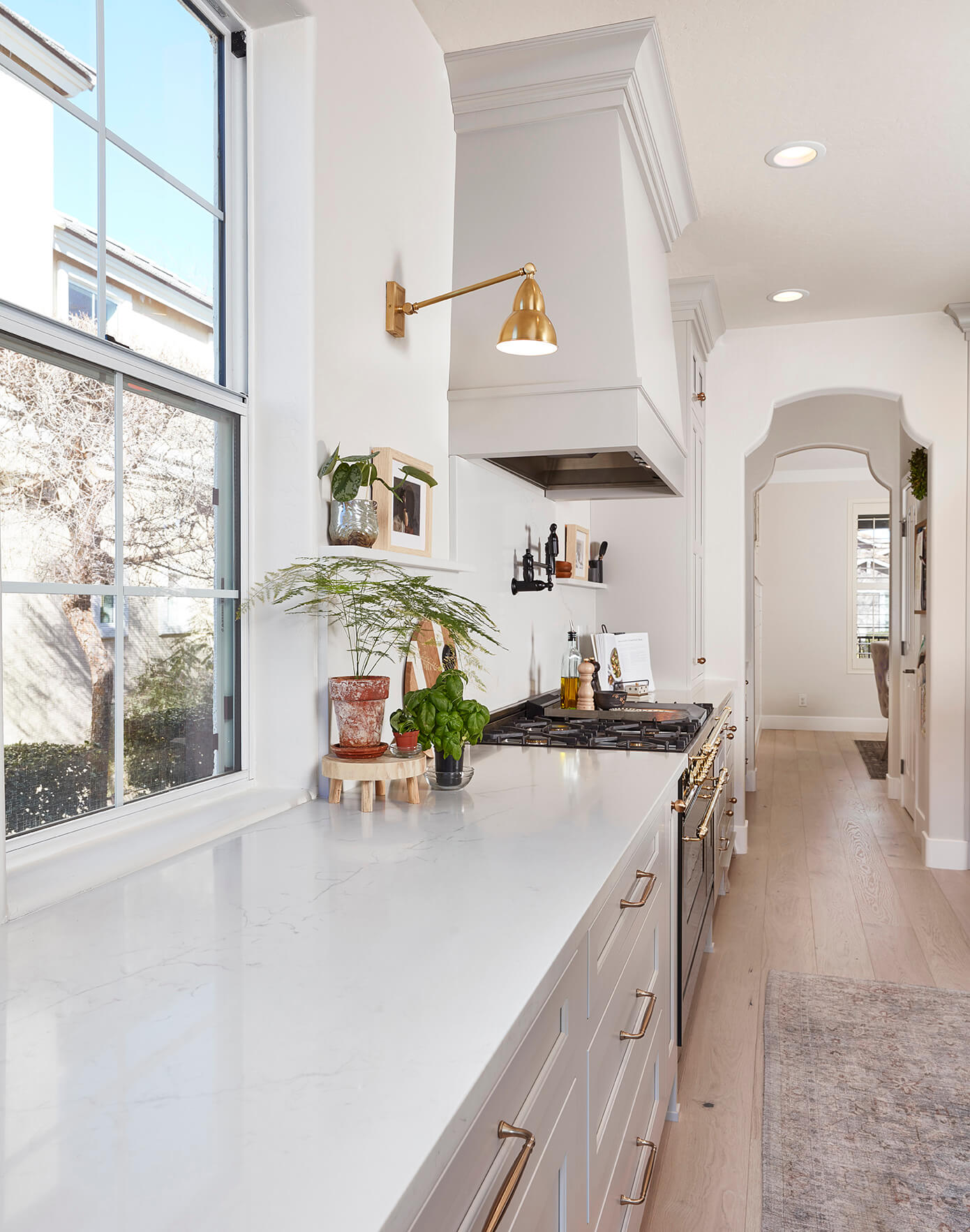
The previous kitchen was very dark and closed in with a peninsula that created a frustrating traffic flow through the kitchen. “The old design made everything in the room feel smaller,” explained Carrie, “The biggest challenge was determining how to brighten the kitchen design with lower ceilings and minimal windows.” Without the option of moving walls, the designer created the illusion of more space by using less wall cabinets and lighter woods and finishes.
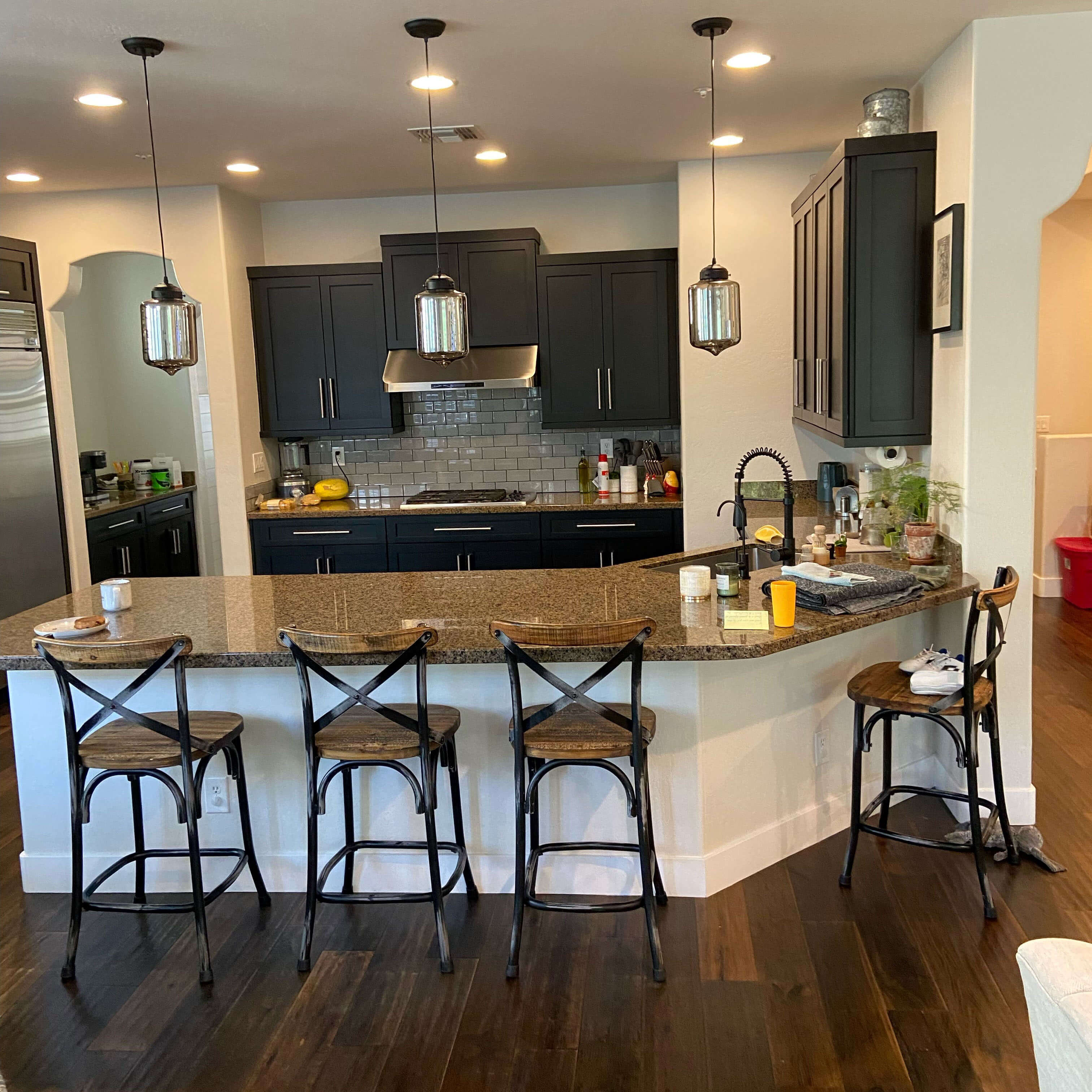
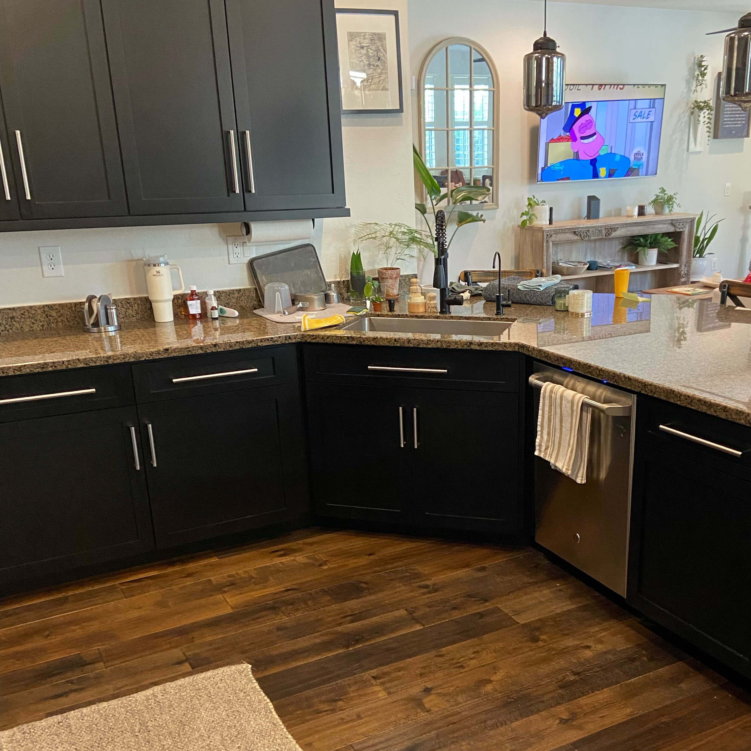
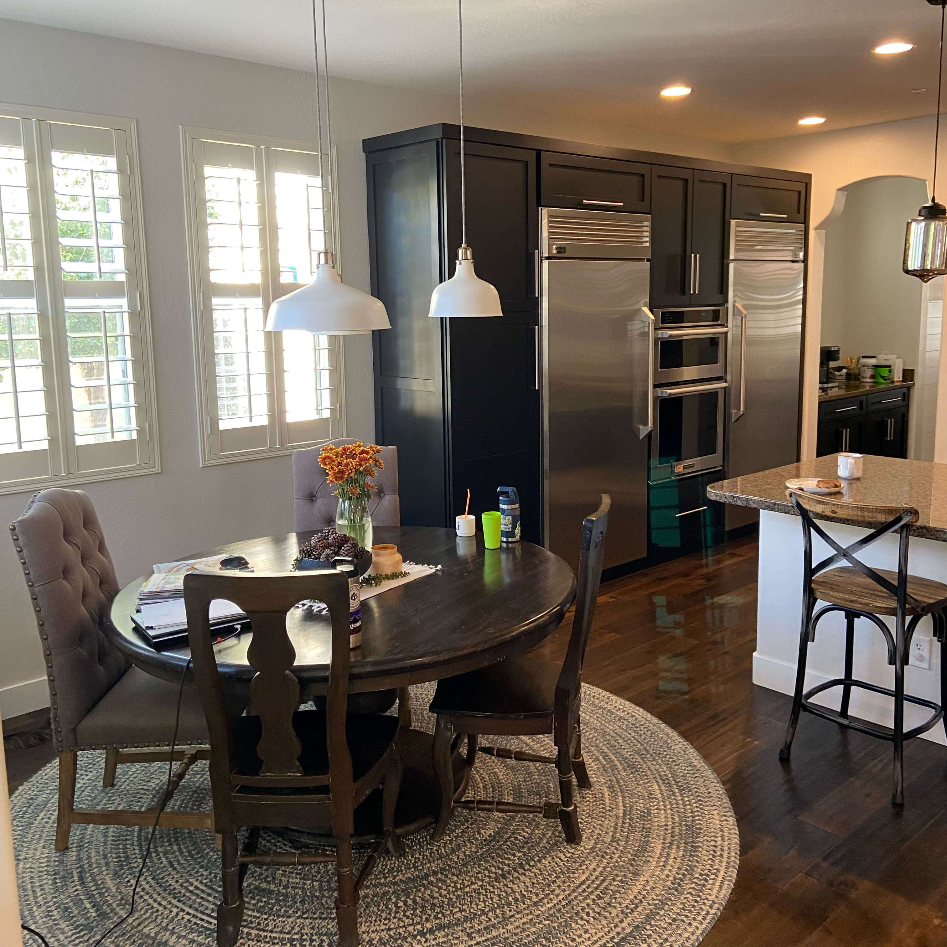
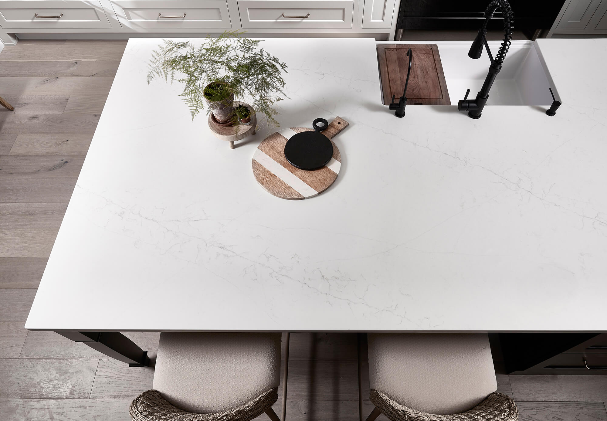
By opting for no wall cabinets on the range wall, Carrie added more storage in other areas by creating floor-to-ceiling cabinets on the two walls without windows and added a lengthy workhorse of a kitchen island. The new island and the row of base cabinets across from it were both stretched into the dining room’s space to create a larger kitchen floorplan and take advantage of the unused space.
“This remodel taught me that size is not a deterrent! It is all about how we use the space,” shared designer Carrie.
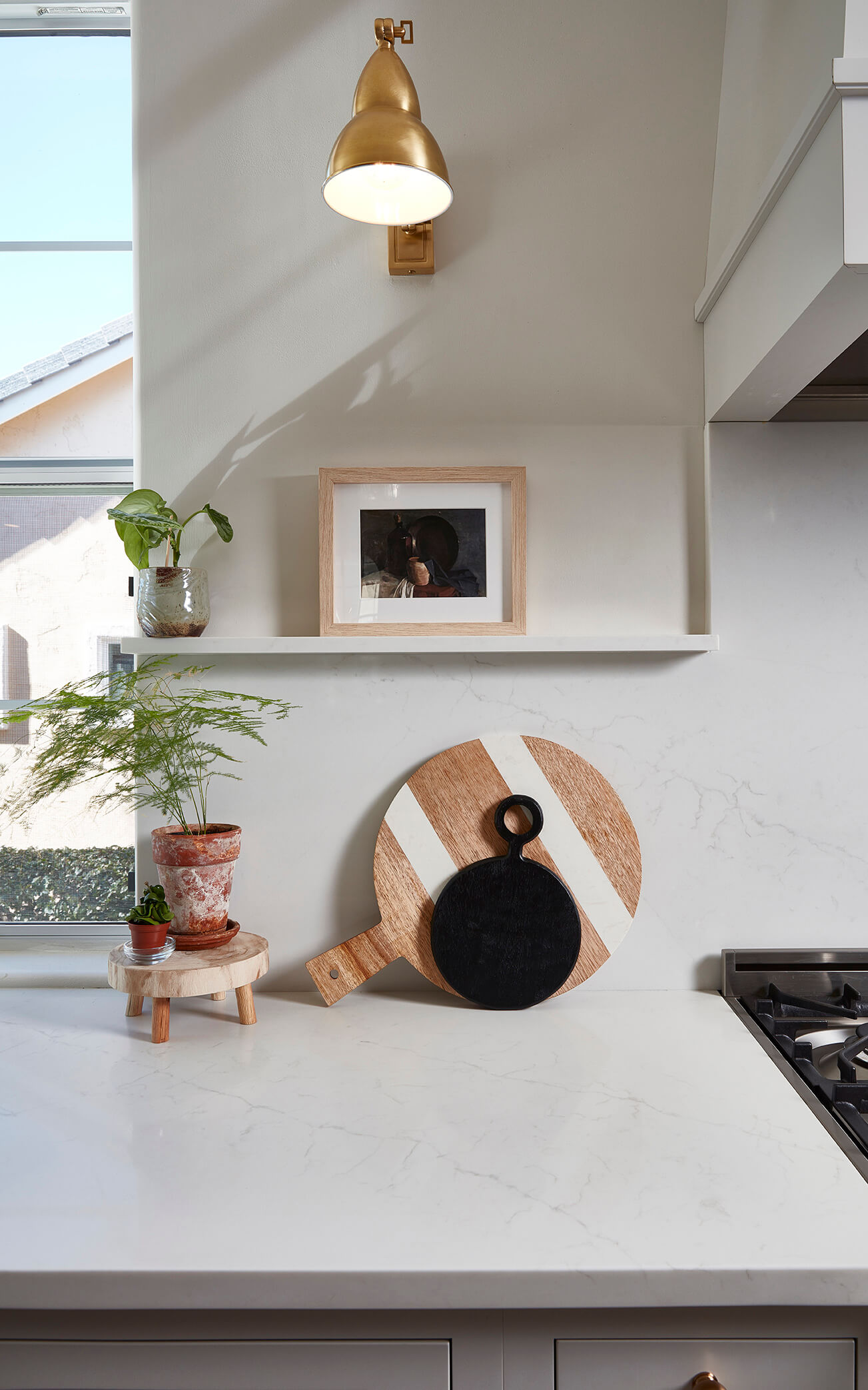
To add more interest to the wall without wall cabinets, the designer added a ledge to create a boarder for the solid quartz backsplash and provide a beautiful space to displaying decor.
An Agritopia Style with a Fresh Color Palette
As mentioned earlier, the charming Agritopia neighborhood was the primary inspiration for the new kitchen design. The design needed to be a creative space that encouraged craftsmanship, healthy living, and coming together but with a modern approach.
With that in mind, they selected a classic shaker door style, Highland, and a color palette with soft, true brown stained woods and a pale gray color palette.
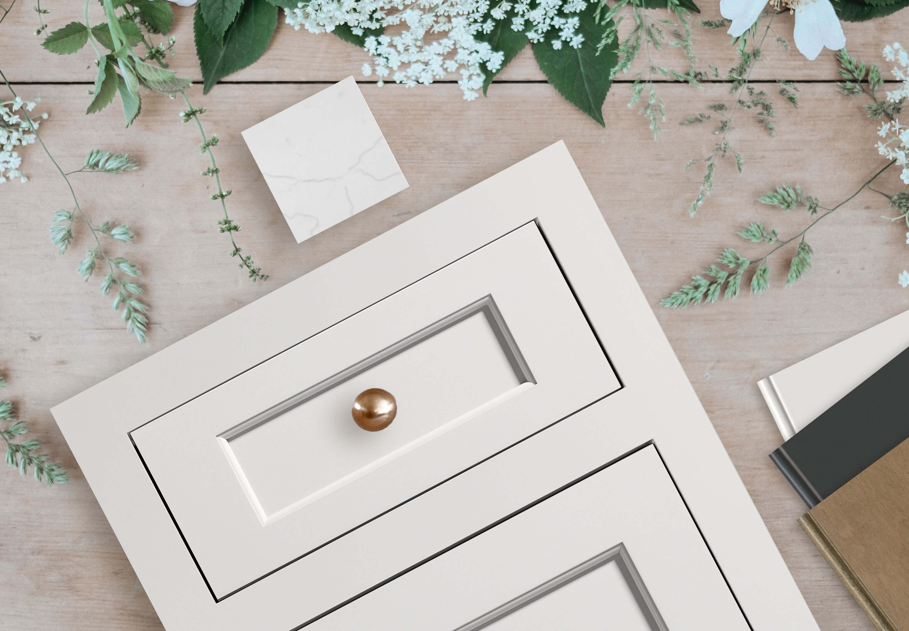
Dura Supreme’s Highland Inset door style in the “Pearl” paint shown with finish samples of “Pearl” paint, “Graphite” paint, and “Cashew” stain on Maple.
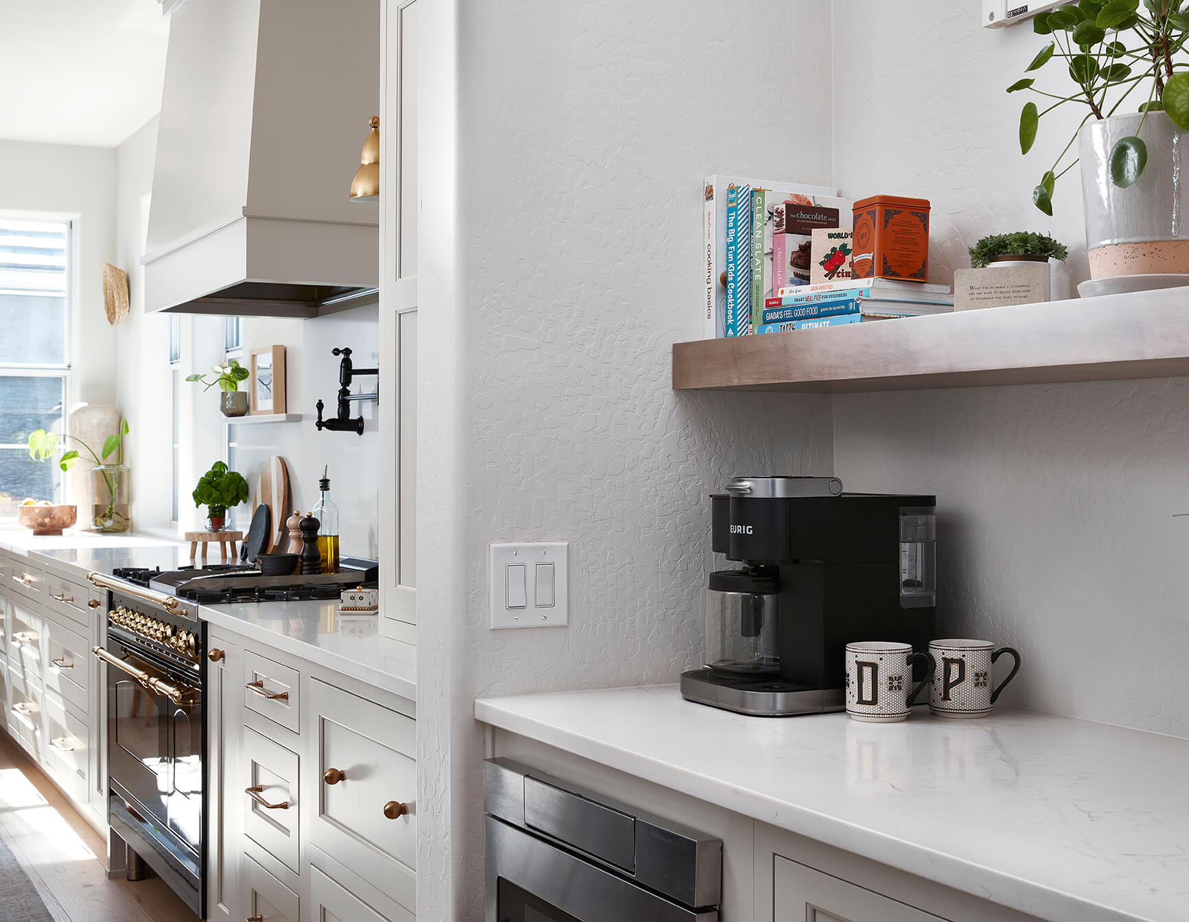
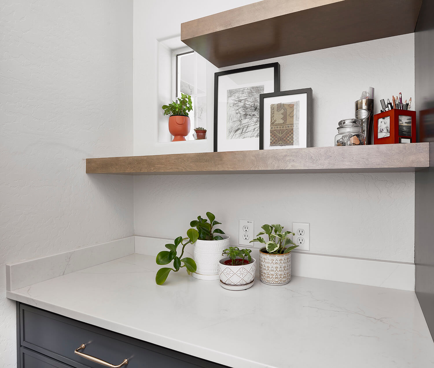
“The beauty of the wood stands out in this home with several detailed accents like the floating shelves in the butler’s pantry,” explained Carrie.
Creating a Consistent Style Throughout the Home
The main floor powder room and laundry room were also renovated to fit the new style of the kitchen.
The Remodeled Powder Room
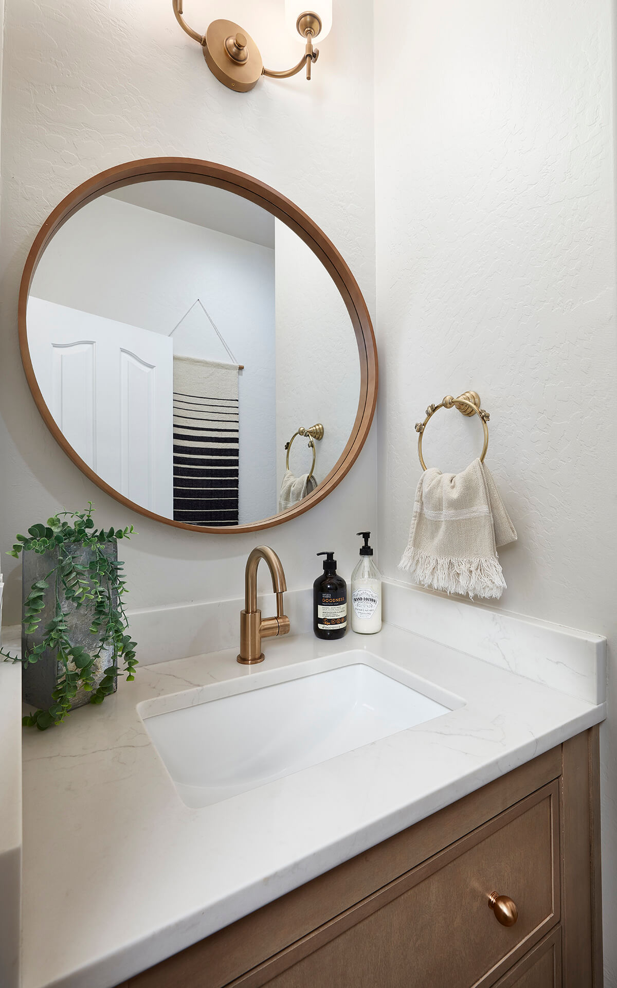
For the powder room, Carrie recommended the same “Cashew” stain on Maple to coordinate with the various kitchen accents. To mix things up they selected our skinny shaker door called Reese to give the vanity more of a boutique, furniture-style look.
The Laundry Room Remodel
For the laundry room, they used the same “Graphite” paint used on the kitchen island, and the Reese door style to coordinate with the powder room. They also matched the style of the floating shelves from the kitchen’s butler’s pantry.
The redesign completely transformed the space into a beautiful sanctuary. ““I love it!” exclaimed Carrie, “I’m very pleased with how everything turned out and Denise is extremely happy with the design & new cabinetry. She loves entertaining in the new space!”
