The color scheme you select for your kitchen remodel could be inspired by many things. Maybe it’s based on existing furnishings, a favorite piece of art, or simply colors that strongly resonate with you.
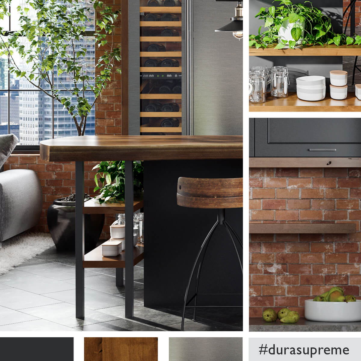
Above we see the warm brown-red tones in the brick echoed in the stools, and the black architectural windows paired with black metal legs and black painted cabinetry.
There are many design elements and products that come together to create a complete kitchen. With so many different materials colliding in one room, it is important to evaluate how the colors and textures of each element coordinate. Having a well-designed, intentional color scheme can help ensure you’ll have a cohesive color palette that’s appealing to the eyes verse a hit and a miss.
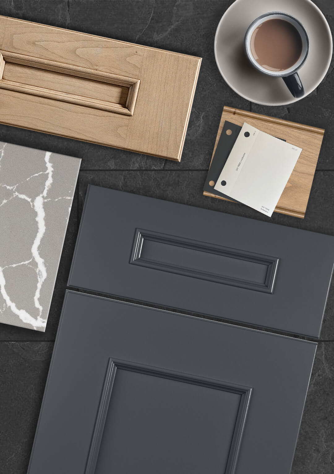
Color Board design by Kitchen Design Center by Gramophone in Cockeysville, Maryland, featuring Dura Supreme’s Middleton door style in a dark gray Custom Finish stain on Maple with a sample of “White” paint.
What is a Color Path?
One important process with any kitchen design project is the development of a color path (also known as a design path) that creates a coherent, well-planned look for the entire space using an appealing color palette.
How to Create a Color Path
When trying to identify the first color to start your color path journey, resist the temptation of selecting the wall color first. Wall paint is an inexpensive element. Plus, there are nearly endless color options that can easily match any interior design. It’s also much easier to change the wall color verse changing out cabinetry or countertops if you change your mind down the road.
Kitchen design by KSI Kitchen & Bath in Birmingham, Michigan featuring Dura Supreme Cabinetry’s Reese door style in a combination of the “Pearl” and “Graphite” paint finishes.
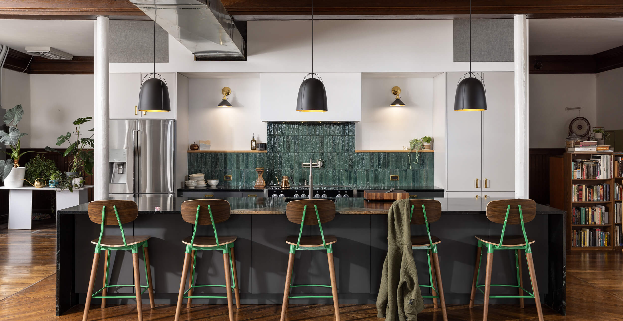
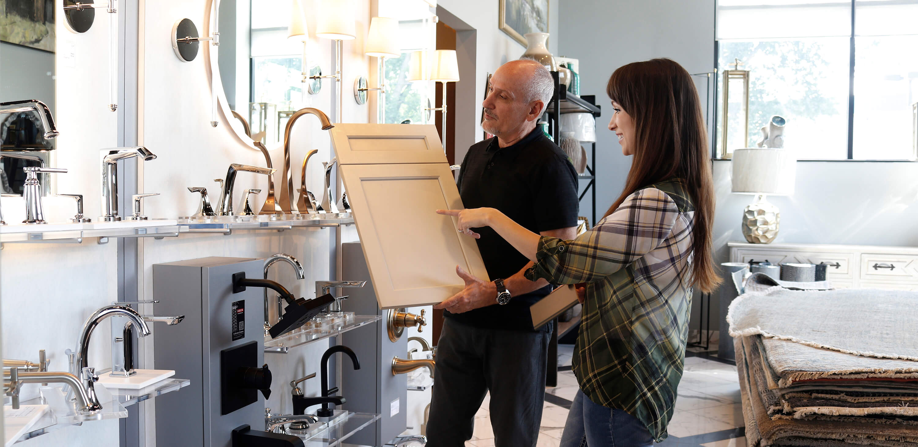
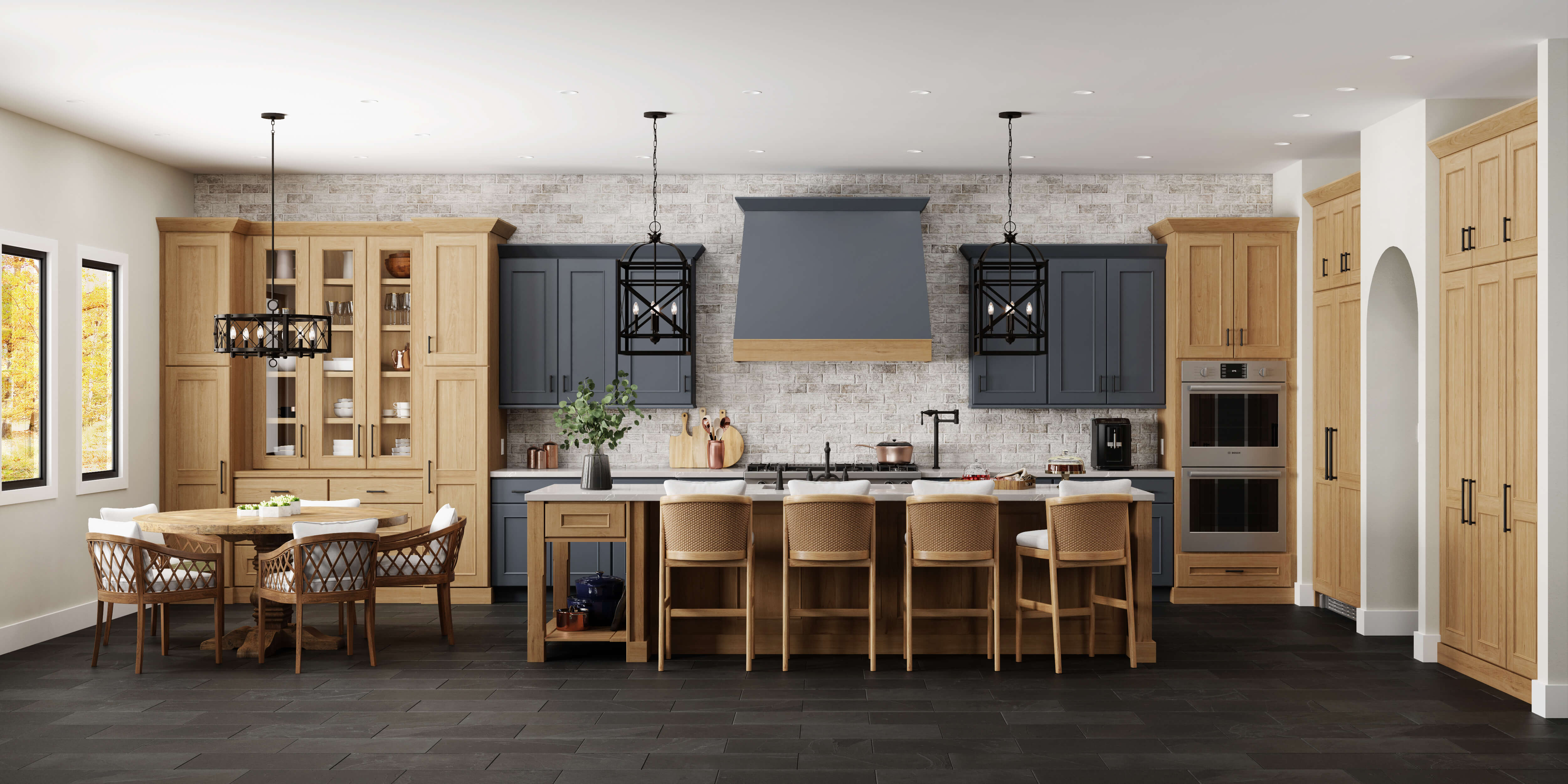
With that said, it is best to begin your color path with an element that is more permanent and harder to switch out down the road. Choosing coordinating cabinetry and counter colors helps determine the initial direction of the color path. In the above kitchen, we see the larger scale elements – cabinetry, flooring, countertops, etc. embracing brown, black, and white with some splashes of Emerald Green as an accent.
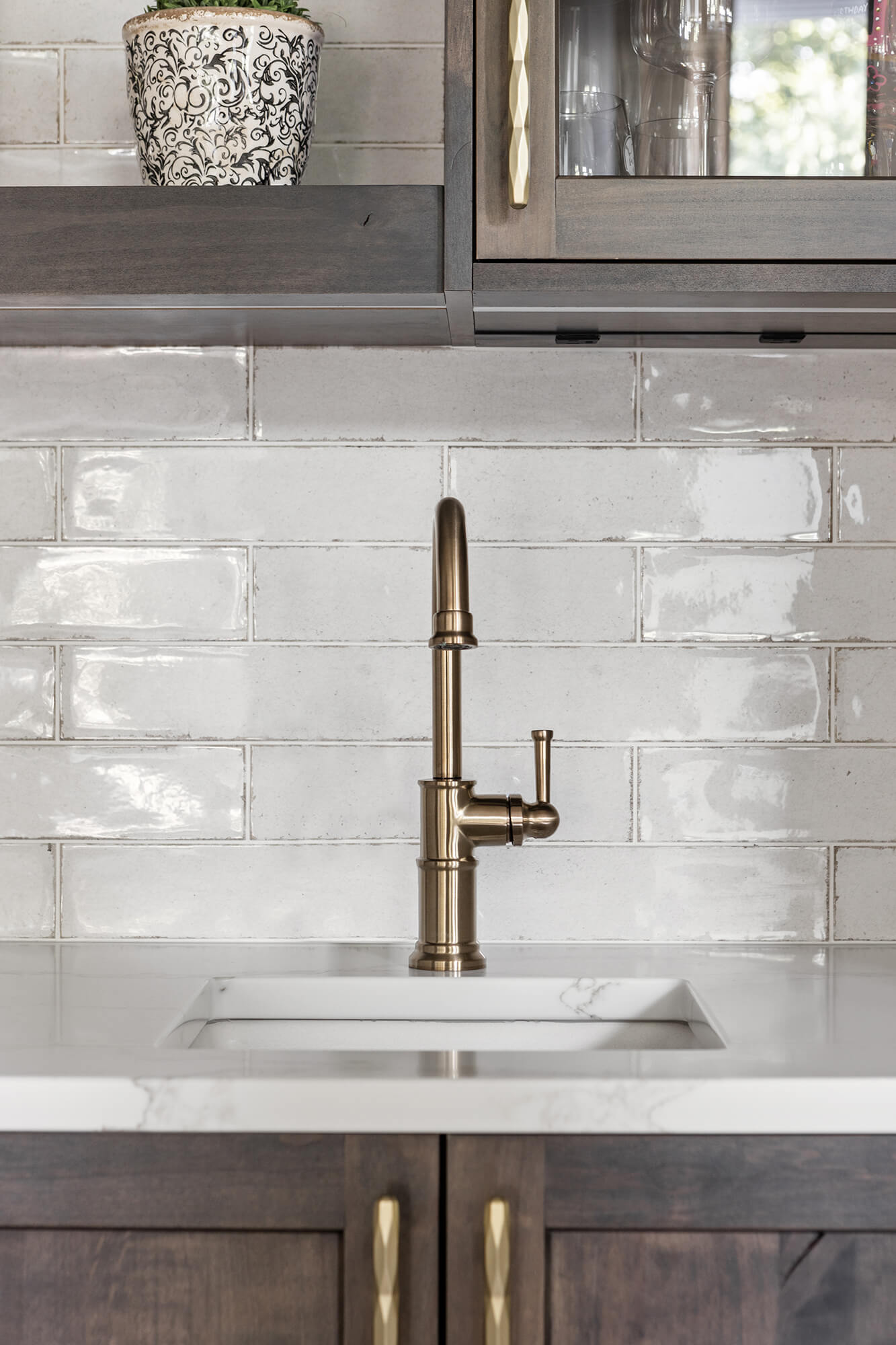
After the primary countertop, flooring, and cabinetry selections are chosen, it’s time to pair them with other large-scale accents like wall colors, backsplash materials, kitchen appliances, etc. The final touches, often referred to as the “jewelry” of the kitchen should be addressed last. These are small-scale features like hardware, lighting, and plumbing fixtures.
Dura Supreme Cabinetry design by Emergent Construction in Indiana.
Dura Supreme Cabinetry design by Emergent Construction in Indiana.
Dura Supreme Cabinetry design by Emergent Construction in Indiana.
For the kitchen pictured below, a soft neutral palette with ivory, beige and a mix of coastal blue hues was selected using our Personal Paint Match Program. The program is a simplified custom paint option that offers any Sherwin-Williams or Benjamin Moore paint color from over 5,000 colors. It’s a popular option for homeowners looking for a specific cabinet finish for their kitchen cabinetry.
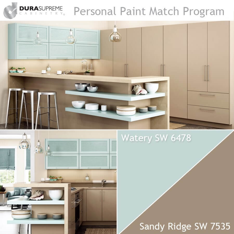
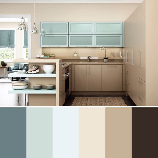
To recap, first, the cabinetry was specified in the desired finishes to start the color path. Next, all of the hard surfaces, soft goods, plateware, and accent pieces were selected to coordinate. The end result was the one-of-a-kind, fun, coastal kitchen color palette the homeowner had envisioned.
Pay Attention to the Undertones
Undertones are important to pay attention to when pulling together a truly polished kitchen color scheme. An undertone is the underlying color apparent in most colors. You will want to be sure to have the same undertones in any neutrals you choose, otherwise the space will feel disjointed. When you’re selecting your cabinets, counters, tiles, hardware, flooring, etc. your kitchen designer will be a valuable asset in helping identify materials and colors that coordinate beautifully with similar or complementary undertones.
Making a Color Board for Your Kitchen Design
Once the color path has been outlined, the kitchen designer will often physically lay out all the paint swatches, finish color chips, countertop samples, hardware, and fabrics creating a color board (Also known as a mood board).
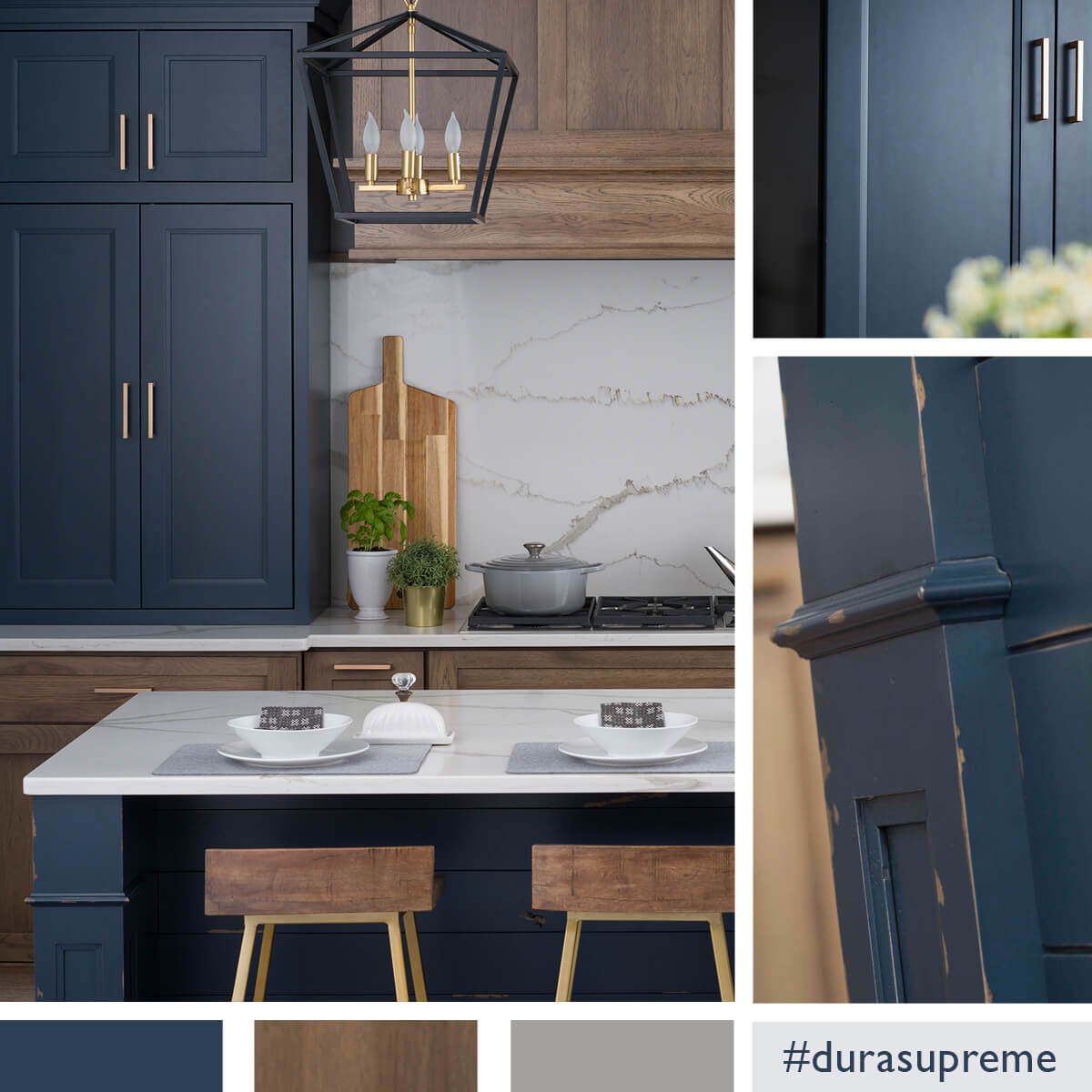
This color board features Dura Supreme’s Middleton door style in a combination of “Cyberspace” paint and “Coriander” stain on Cherry wood.
The color board is the final visual step that helps the designer and the homeowner visualize the color palette for the entire room (or entire home) and explore how all the design elements coordinate and work together. This includes wall paint colors, cabinetry finish colors, flooring, countertop materials, tile, appliances, plumbing, lighting, hardware, etc.
A Dura Supreme kitchen featuring the Middleton door style in a combination of “Cyberspace” paint and “Coriander” stain on Cherry wood.
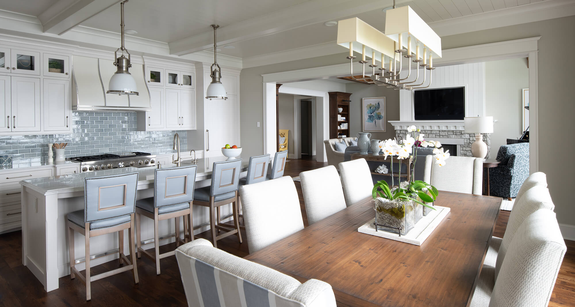
When designing an open-concept kitchen or an entire home, it’s good practice to consider furnishings and other miscellaneous elements that add texture or color to the room. The color palette throughout should play well together and design elements should repeat throughout. An example might be the pale blue in a backsplash could be repeated on an area rug in an adjacent space, or ship lap texture on a fireplace could be repeated on a kitchen island. The idea is to create a cohesive look for the entire space.
Dura Supreme kitchen design by Revival House, Twin Cities, Minnesota.
I hope you found some inspiration for creating your color scheme. If you’re feeling unsure or overwhelmed, don’t fear! The seemingly daunting task of achieving your dream kitchen is made simple with the guidance of an experienced kitchen design professional with a trained eye for color, design, and style. Find your nearest Dura Supreme professional designer to get started designing the ultimate color palette for your kitchen.